Tutorial
To set the MemberGate site to be mobile responsive:
Enable Mobile Responsiveness
Enable Mobile Responsiveness
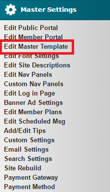
1. From the control panel under 'Master Settings' choose 'Edit Master Template'
2. In the field 'Master Page Layout Style' choose 'Responsive - Automatically adjust site, dependent on browser width' from the

3. Press the Apply Changes button at the bottom of the page
4. Run a full Site Rebuild
Run a full Site Rebuild
Run a full Site Rebuild
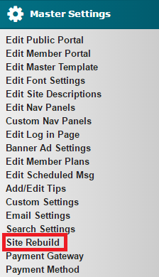
1. From the control panel under 'Master Settings' choose 'Site Rebuild'
2. It likely will not run the full rebuild the first time. The 'Rerun Site Rebuild' link can be clicked to manually run the site rebuild until completed.

3. OR choose 'click here' to run the rebuild automatically until completed. An email will be sent to the webmaster when it has been completed.

4. Site Rebuild has Completed

Notes
NOTE 1: Once the Mobile Responsive design has been enabled, many other functionalities like drop-down menus or mobile settings will be available in the control panel.
NOTE 2: Images, forms, tables and other elements on a page may be set at a fixed width and need to be changed to percentage for the page to be responsive:
https://www.membergate.com/public/Troubleshooting-Mobile-Friendly-or-Responsive-Pages.cfm
User Tip
USER TIP: There is a handy online tool that lets you see how your site will appear in a variety of different browsers and devices.
You can reach that tool here: http://testsize.com/