Advanced Technique
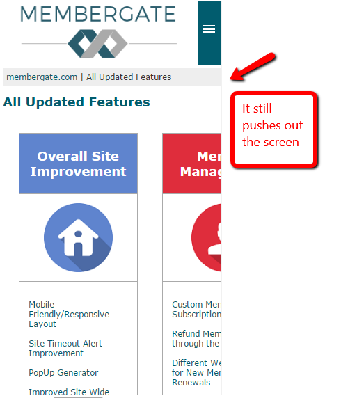
Sometimes a table has too much data to be responsive on smaller devices. The table might still push past the screen viewing area - even if you have used no fixed widths. Follow these instructions to code your page so the table stacks on smaller screens.
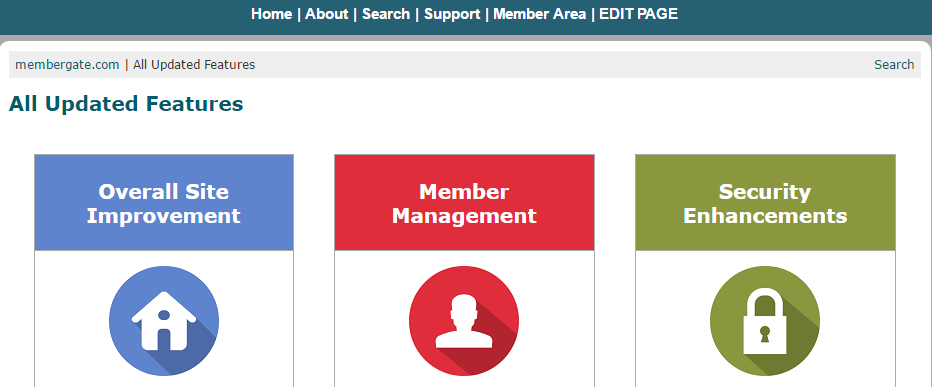
Desktop View:
Mobile View:
The Code
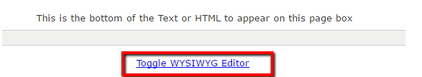
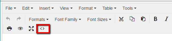
**The first step is to turn off the WYSIWYG editor. Depending on the WYSWYG editor that you are using, this can be completed by selecting 'Toggle WYSIWYG Editor' under the main text box or by choosing the HTML code option from the top menu bar.
The table and the CSS div codes are used in a similar manner. If you already know how to use a table, then you will realize that you are just substitituting the css/div tags for the regular table tags.
Here is traditional table code (in its most basic form):
<table> <tbody> <tr> <td>CELL 1</td> <td>CELL 2 </td> </tr> </tbody> </table>
1. For the open table tag table - substitute
<div class="mgtable">
2. For the closing table /table - substitute
</div>
3. The open TR- becomes
<div class="mgtablerow"> </div>
4. The closing TR - is
</div>
5. The open TD- would be
<div class="mgtablecell mgresponsivecell"></div>
6. The closing TD - is
</div>
So that table would lool like this with the div codes:
<div class="mgtable"> <div class="mgtablerow"> <div class="mgtablecell mgresponsivecell"> CELL 1 </div> <div class="mgtablecell mgresponsivecell"> CELL 2 </div> </div> </div>