Features
The MemberGate software is programmed to be mobile responsive and mobile friendly. This means that when a visitor comes to your site, the software will detect the screen size of the device being used and will adjust the page view automatically.
This is an essential feature for Search Engine Optimisation, as Google will not show any search results for web sites that are not mobile friendly
However, it is important to note that just because the software is mobile friendly, doesn't necessarily mean that all of your pages will display responsively. There are a few other requirements that you will need to review and update in order for all of your site's pages to be fully responsive.
If you or your members notice that a page is pushed out when viewing on a mobile device, please look below for some tips and tricks to 'fix' those pages.
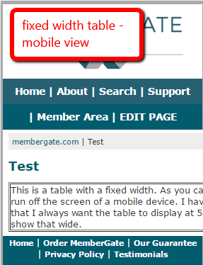
Pages can't shrink to fit smaller screens if they have a fixed width!
HTML coding can contain many fixed width attributes. Check items on your pages like:
- tables,
- images
- iframes
These may have been added to your pages with a fixed width. Coding with a fixed width will look similar to this:
width="500px"
When the width is fixed, that table/image/iframe will display at the set number of pixels no matter the screen size.
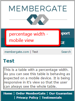
Instead, those width attributes can be completely eliminated or they can be set as a percentage. A width set as a percentage would look similar to this:
width="100%" or width="50%"
 |
 |
The video and audio players built into MemberGate are mobile responsive.
If your site uses a third party player to embed video on your pages, you will need to check if they are 'responsive' players
Not all third party players are mobile friendly and so they can stretch the page when viewed on a mobile device or tablet.
Contact the support team of the third party player to see if they have a mobile responsive option for their players.
Simply replace the new mobile responsive code for the older non-responsive code.
 |
 |
Video Code that Isn't Responsive
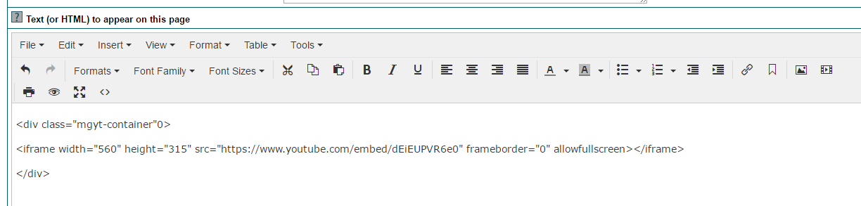
If your third party video supplier doesn't have responsive code, add a div code with the class mgyt-container around the third party code.
For example, let's assume you would like to add a youtube video to your pages. The youtube video embed code looks like this:
<iframe width="560" height="315" src="https://www.youtube.com/embed/dEiEUPVR6e0" frameborder="0" allowfullscreen></iframe>
To make it mobile responsive add the div class="mgyt-container" before the youtube code and a closing /div after the youtube code.
That would look like this:
<div class="mgyt-container"> <iframe width="560" height="315" src="https://www.youtube.com/embed/dEiEUPVR6e0" frameborder="0" allowfullscreen></iframe> </div>
Paste the video code directly in the 'Text (or HTML) to appear on this page' box where the third party product will appear.
If the third party company does not have the option to include a responsive or mobile-friendly code, there may be another solution.
There is CSS built into the software that can be added to your pages to make codes like generic iframes, YouTube videos, Vimeo Videos, Instagram pages, etc mobile responsive.
To make any of the above mobile responsive, add a div code with the class mgyt-container around the third party code.
For example, let's assume you would like to add a youtube video to your pages. The youtube video embed code looks like this:
<iframe width="560" height="315" src="https://www.youtube.com/embed/dEiEUPVR6e0" frameborder="0" allowfullscreen></iframe>
To make it mobile responsive add the div class="mgyt-container" before the youtube code and a closing /div after the youtube code.
That would look like this:
<div class="mgyt-container"> <iframe width="560" height="315" src="https://www.youtube.com/embed/dEiEUPVR6e0" frameborder="0" allowfullscreen></iframe> </div>
Paste the video code directly in the 'Text (or HTML) to appear on this page' box where the third party product will appear.
Subscription Forms created using the Subscription Form Generator are mobile responsive. If the subscription forms are set with the older method (using the raw HTML code), the form will not be mobile friendly. The subscription forms do have to be updated using the Subscription Form Generator.
Please see this tutorial to create the Mobile Friendly Subscription Forms
Sometimes it is difficult to tell which code is the culprit on a page and it takes a bit of troubleshooting. One way to determine which code on a page may be causing the page to not be responsive is to isolate each section of coding on the page. Then bit by bit, add each section of code back to the page and test the page with a mobile view on Screenfly
There are various ways to test the page and isolate the code. Below is one way to test.
1. Save the original html code on the page. This can be completed by copying and pasting all of the page's HTML code onto a simple text program like Notepad. In case the code needs to be restored, it is a good idea to save the original first.
2. In the editor on your site begin isolating each section of code. Isolating the code can be completed by commenting out each separate section of code. An html code commenting tags looks like this example:
<!---CODE TO COMMENT OR HIDE --->
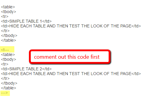
Here is a screenshot of coding for a page that has two tables:
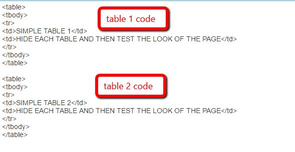
3. Test the first elements on the page. This can be completed by adding comment codes around all of the other code on the page.
 4. After commenting out the code, apply changes to the page and then test by viewing the page on Screenfly
5. If the page displays as responsive, edit the page again since that code isn't the issue. Adjust the comment tags so they also comment out the first section or first element. Remove the comment tags from the second element:
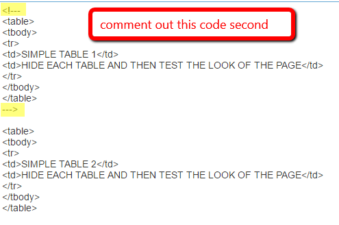
6. Apply changes to the page and test again on Screenfly.
7. Repeat this process until you are able to see which code is the problem code. Sometimes there may be multiple sections of a page that can cause issues, so it may require you to test some more even after finding one problematic code structure.