Tutorial
The Mobile Settings is ONLY available when using the Legacy Theme. If any other theme is selected, this option will not be available in the control panel.
The look and feel of your site on a mobile device can be different or similar to your desktop site.
The mobile version can be edited under 'Edit Mobile Styles.'
Update the Colors of the Mobile View
Click on each section to expand for more information.
The Mobile customization can be found under Appearance Mobile Styles
The first 5 Logo Graphic fields are to allow you to upload the header graphic for your site that will show under certain size conditions.
The Max width refers to the width of the amount of pixels the screen is that the user is viewing the site.
For example, a max width of 720 might include some tablets like ipads, where a max width of 320 might include an iphone. If your logo is text intensive, you may want to consider using that for a desktop version of your site, but remove the text for a smaller screen.
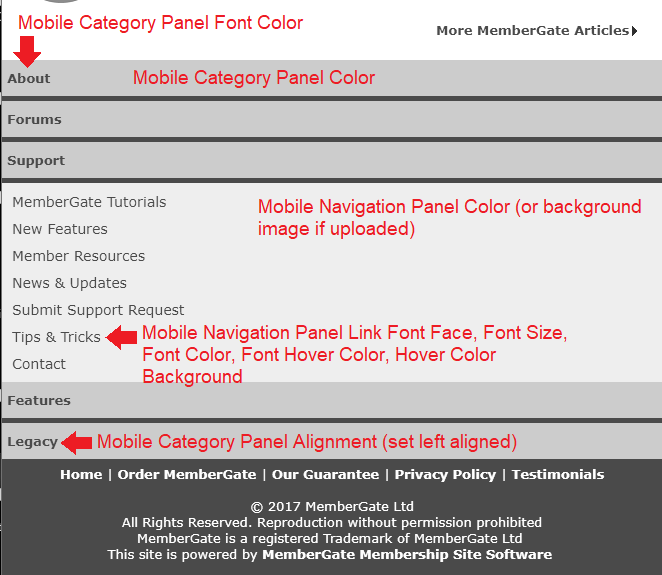
The remaining fields are the look and feel of the site. Any colors would have to be input with a hexadecimal color code. Please see an example screenshot below to see the parts of the mobile site that each field will change.
Update the Font Sizes on Mobile
Click on each section to expand for more information.
The Mobile Font Settings customization can be found under Appearance Mobile Font Settings
Enter a font size for each of the different sized screens. The Max width refers to the width of the amount of pixels the screen is that the user is viewing the site. For example, a max width of 720 might include some tablets like ipads, where a max width of 320 might include an iphone.
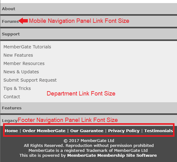
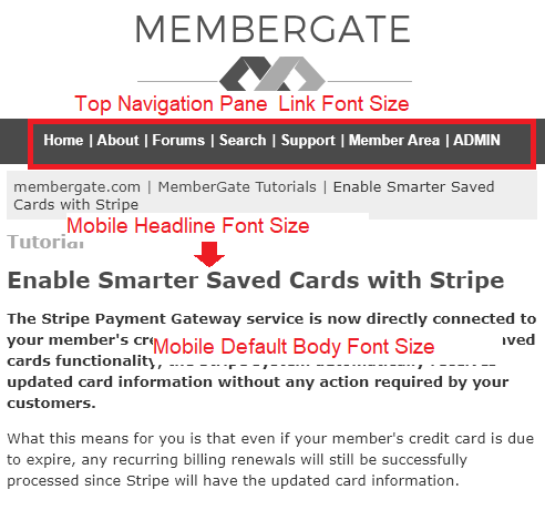
See the image below for each of the areas to update:
Top Portion of the Mobile View
Bottom Portion of the Mobile View