
It's important in web design to maintain the same image dimensions, specifically for teaser images and main graphics on a page. Using the same dimensions will create a more uniform and appealing look for your website.
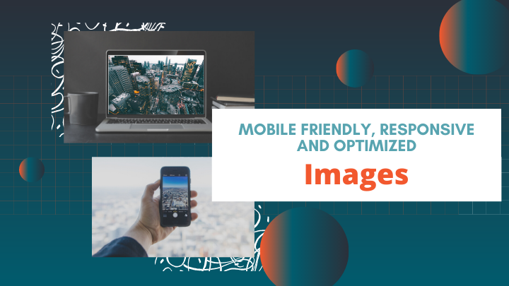
In the modern age, multiple different screen sizes and resolutions are used to browse the web. Therefore, it's important to use images sizes that will always look great!
Understanding Aspect Ratio
The aspect ratio of an image is the proportional relationship of the width to the height. Popular aspect ratio sizes for websites are 16:9 or 4:3. These are the proportions of the width to the height. A 16:9 aspect ratio means for every 16 inches of width that an image has, it will also have 9 inches in height. When you expand the image it will always maintain the same shape and will always display as intended. It will not stretch or lose resolution.
The Dimensions of Tease Images
A good rule of thumb is to use the same dimensions of images as best as possible. If it is not possible to have the same exact dimensions, it is important to have the same aspect ratio. If you are using a 16x9 guide for images, this means one image could be 1920x1080 and another 640x360 and they will still maintain the same shape and will display the same on most screens.
The tease images on your site should all be the same ratio - common web image ratios are 4:3 or 16:9. The 16:9 size is shaped more wide screen while the 4:3 is full screen. The 16:9 format has been made more popular by the movie industry and so televisions, PCs, laptops and even mobile phones (turned sideways) support this universal ratio.
Since the images within the site will resize themselves, it is safe to use images at this size for whichever ratio that is selected.
Aspect Ratio |
Suggested Image Dimensions |
Display Style |
Sample |
|---|---|---|---|
16:9 |
640x360 |
Wide Screen |
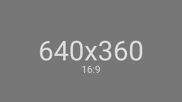 |
4:3 |
600x450 |
Full Screen |
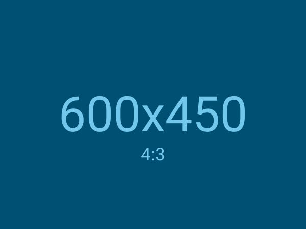 |
Whichever ratio that is selected, it is important to keep all of the images at a consistent ratio - do not mix and match. They should all be 4:3 or all 16:9.
Tease Layouts
MemberGate tease layout options allow you to have different layouts to provide more interesting ways to present information on your site.
A combination of clumps with one layout and the department listing using a different layout can be used to present information in order of importance, and to highlight certain content pages. The layouts can be further edited to show teaser copy or just include the title of the page for further design flexibility.
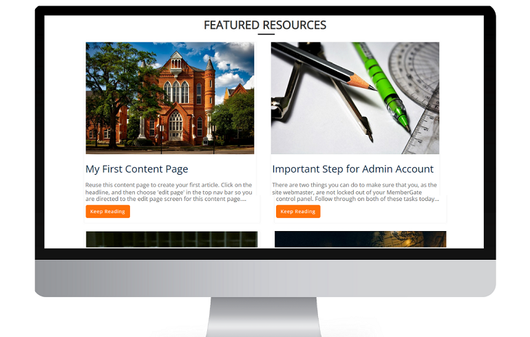
What is the Teaser Image
The teaser image is considered the thumbnail image that is shown along with the published headline and teaser copy of content pages. They can be seen on portal, department pages, LMS and shopping cart pages.
16:9 Aspect Ratio Grid
Title of First Page
Title of Second Page
Title of Third Page
4:3 Aspect Ratio Grid
Title of First Page
Title of Second Page
Title of Third Page
Random Aspect Ratio Grid
Title of First Page
Title of Second Page

Title of Third Page
How to Update Image Sizes
The built in MemberGate image editor can be used to update the dimensions of your images. If the image cannot be perfectly set to the selected aspect ratio, use a crop tool to cut out the desired dimensions.
What does Being 'Reponsive' Mean for an Image
A reponsive web page will dynamically (and automatically) change in size and layout depending on the size and orientation of the screen that's being used. As the viewport changes size, the elements on the page will adjust accordingly. This means that an image can be displayed at 600 pixels wide on a laptop screen, but only 200 pixels wide on a smaller mobile device. Because of this, consideration should be used when deciding on what type and size of image to use.
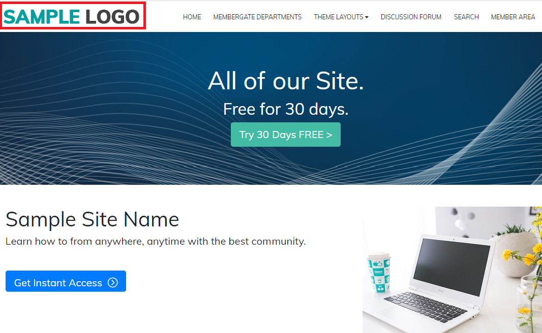
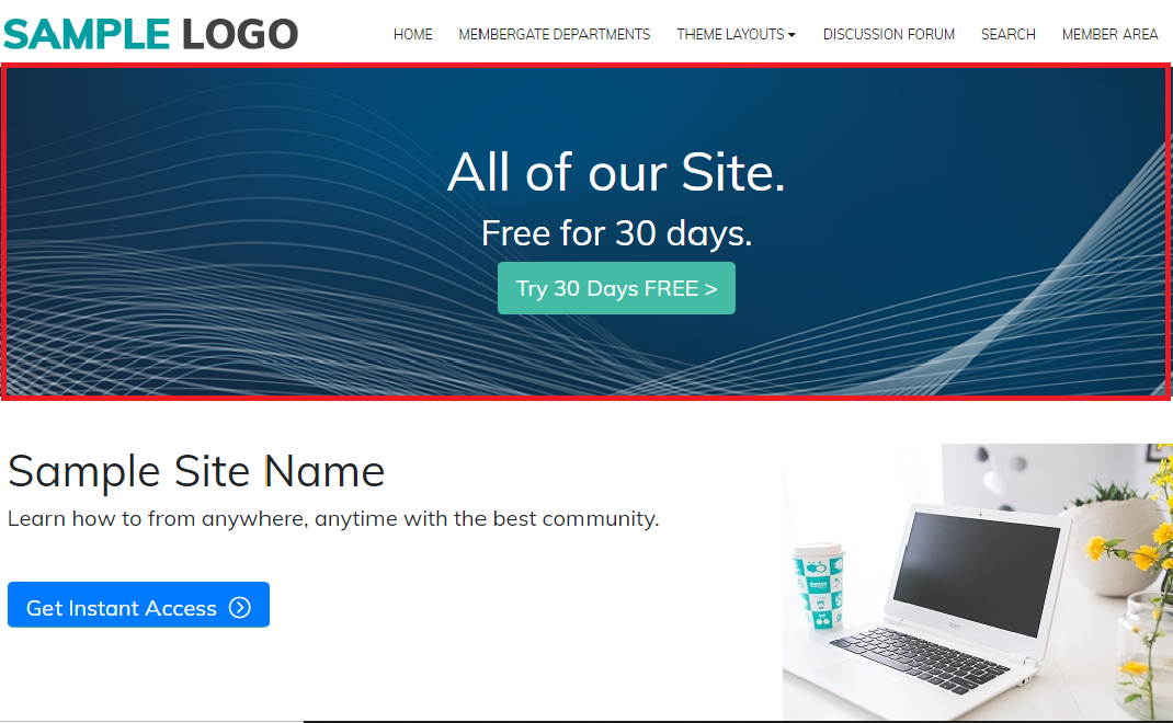
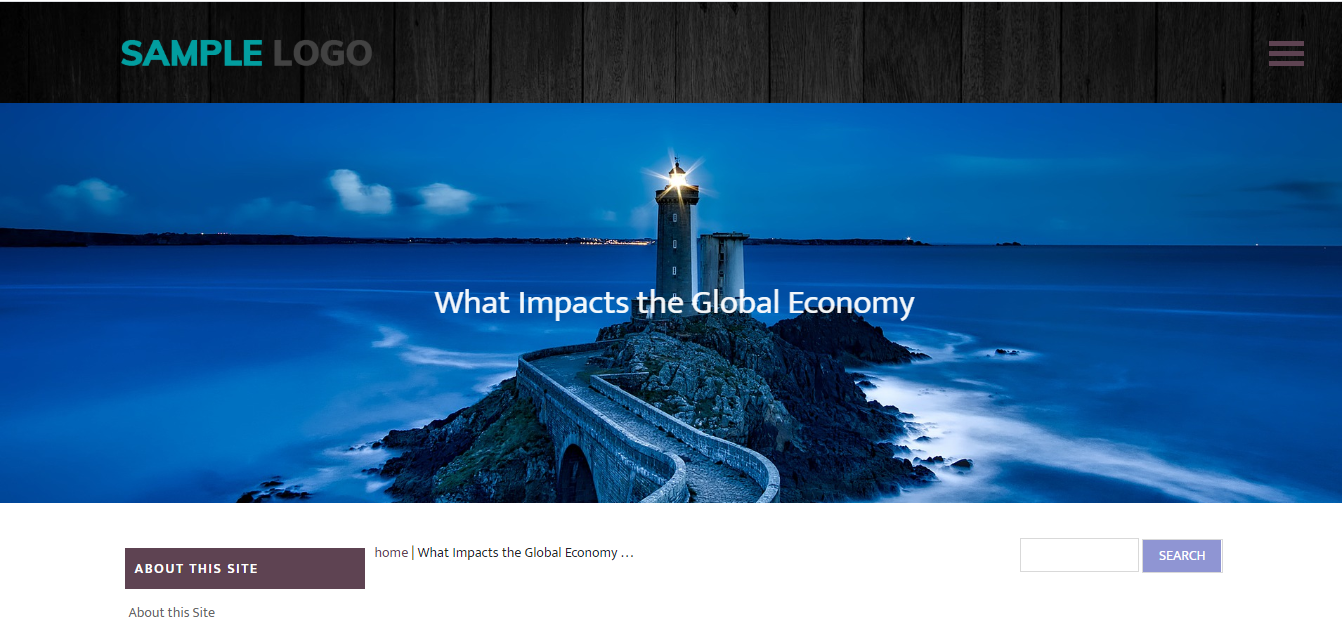
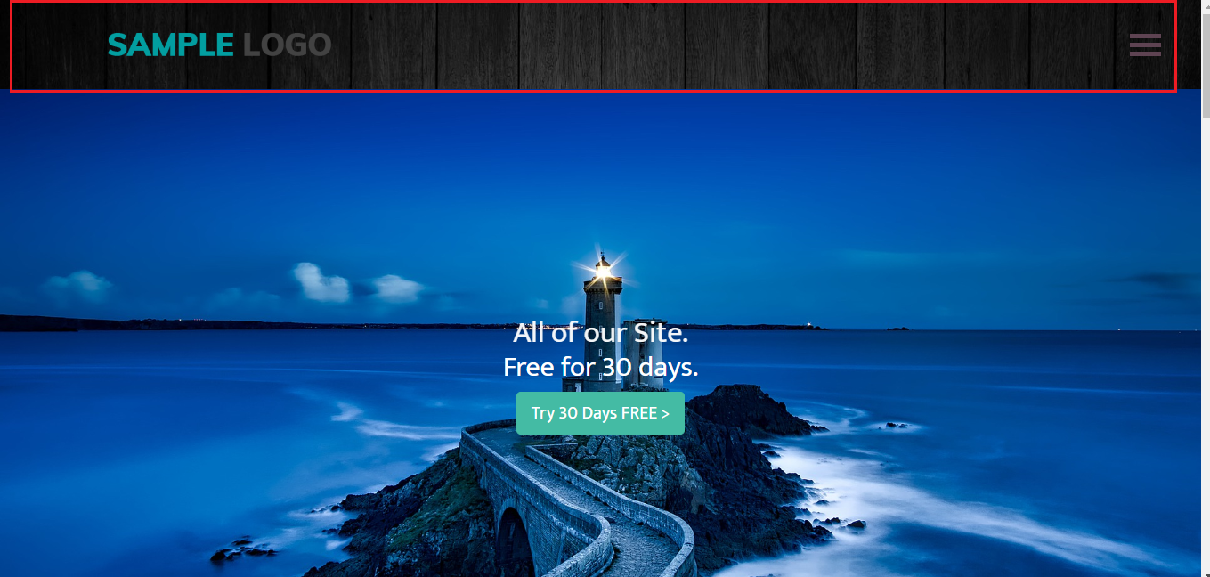
Special Image Sizes When Using a Theme
MemberGate themes require a header/logo graphic as well as hero banner. Use the following chart as a guide for the logo and banner size to be uploaded to the theme or main graphic of your pages.
IMPORTANT NOTES on hero image best practices:
- Because the hero image is a viewport, it is not responsive. The image will not always show at 100%. Parts of the image may not show on some screensizes.
- The hero image is used as a background image. Keep this in mind when choosing an image
- The hero image is not meant to have text on 'top of' the image. Because the image is not responsive, there is a good chance that all of the text will not be seen. (If there is text as part of the background of the image, that should be fine.)
- In many of the themes, the headline of a page will be an overlay on the hero image (which is another reason not to have text on the image).
| Theme | Logo Dimensions | Hero Banner Home Page | Hero Banner Inside Pages | Top Header Dimension |
|---|---|---|---|---|
| Advisor | 293x33 | 1920x650 | 1920x290 | NA |
| Alpha | <744x44 | 1920x300 | 1920x300 | NA |
| Darkness | <744x44 | 1140x300 | 1140x300 | NA |
| Aspire | 285x31 | 1920x884 | 1920x470 | NA |
| Fusion | 340x44 | 1140x300 | 1140x300 | NA |
| Gemini | 270x31 | 1920x300 | 1920x300 | NA |
| Journey | 255x31 | 1920x982 | 1920x400 | NA |
| Maxima | 195x31 | 1920x884 | 1920x300 | NA |
| Metro | 292x47 | 1920x884 | 1920x400 | NA |
| Origin | 255x32 | 1920x884 | 1920x400 | 1920x104 |
| Zen | 180x30 | 1920x884 | 1920x300 | NA |
| Revive | 190x25 | 1920x884 | 1920x510 | NA |
Related Articles


© 2025 MemberGate Ltd
All Rights Reserved. Reproduction without permission prohibited
MemberGate is a registered Trademark of MemberGate Ltd
Site Privacy Policy & GDPR